Zavvi Gallery is home to prints and posters from the best designers and illustrators in the business, becoming a part of the growing alternative movie poster scene.
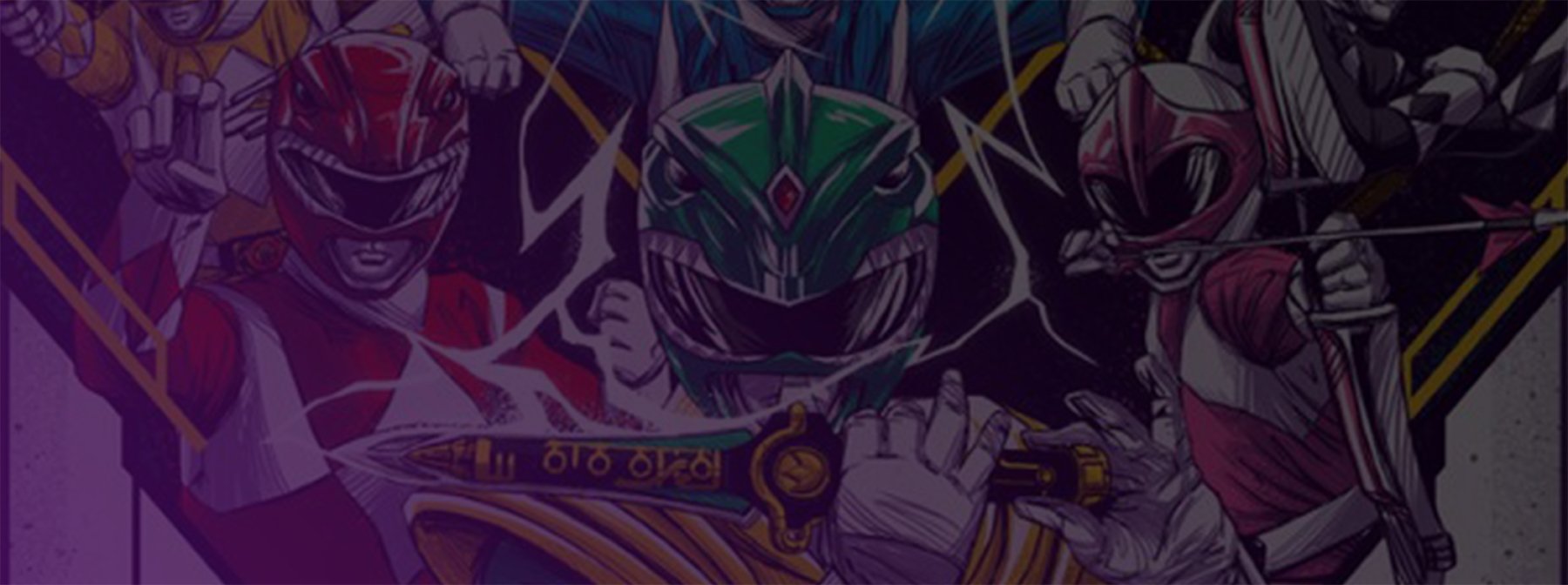
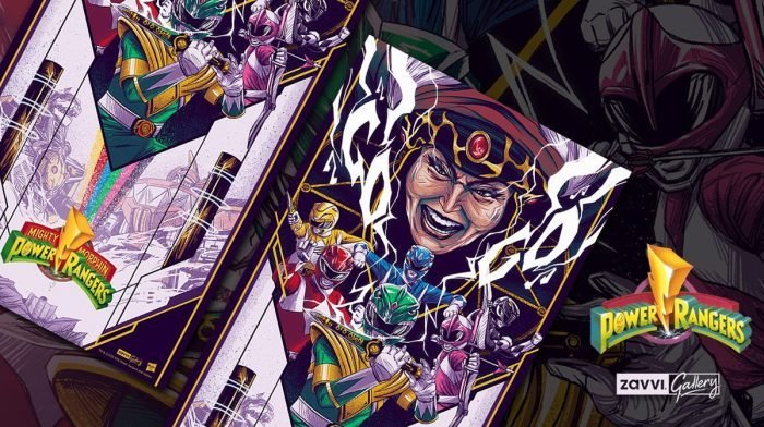
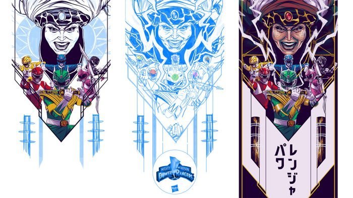
And the latest addition is this colourful and stunning giclee print which celebrates the iconic show Mighty Morphin Power Rangers.
The Zavvi Blog chatted to artist Jaren Hemphill about the inspiration behind the print, the design process and why he loves Power Rangers.
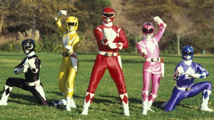
My introduction to Power Rangers is one of my earliest memories. I was born several years after Mighty Morphin Power Rangers, so I watched a lot of reruns as the years passed of MMPR, Zeo, Turbo, In Space, Lost Galaxy, etc. I still enjoy the show ironically, and appreciate the impact it has had on millions. Personally, I think it helps me appreciate the corny side of media, also helping fuel my love for things that are over the top, colourful and goofy.
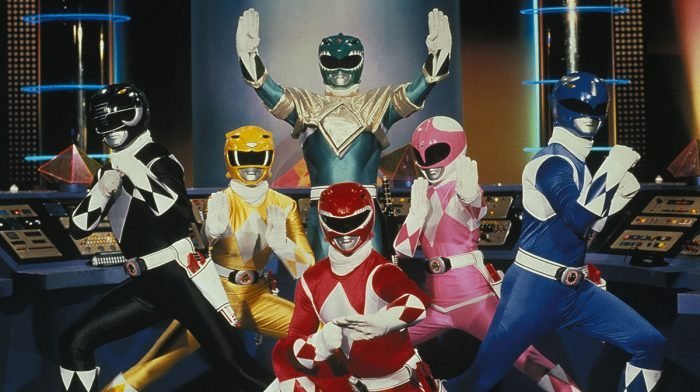
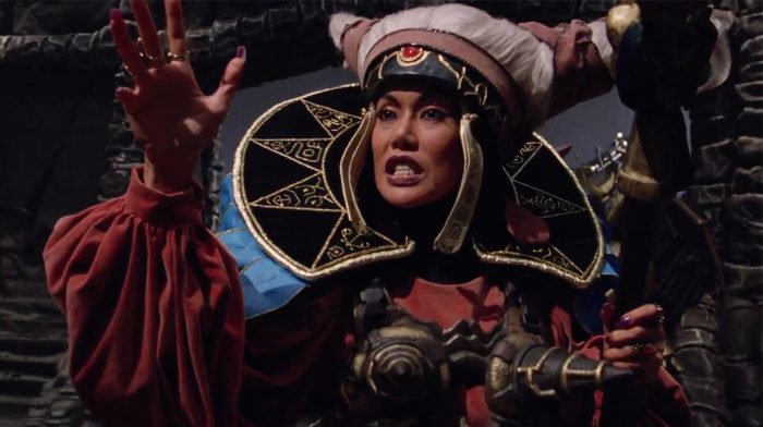
With this print, I mainly focused on season one of MMPR. I love Rita and Tommy, so I wanted them to be the core two points of the composition, with the third being the title. I wanted to capture the corny, 90's aesthetic of the show through the eyes of a child. It's metal, loud, and shiny. I always find words help me in paving a path for a piece. In this case, I wanted to make the piece sing the theme song. It's corny, over the top, and cool.
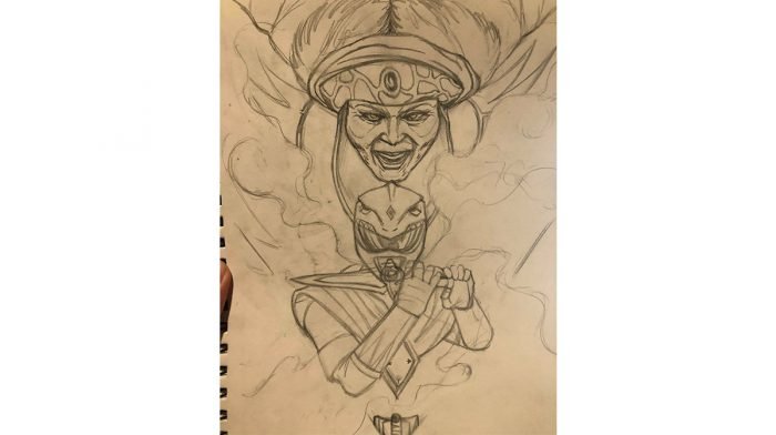
I spent 40 hours on the illustration in four days after completing the initial concept, which took me a couple hours to figure out. I remember finding the Power Rangers bad-ass, and I loved the costume designs, especially the Megazords, so I always wanted them in the piece but they weren't illustrated in until much later. In the initial concept there is a lot of white space behind the title, but it was easy to understand where to take that white space once Rita and the Power Rangers were completed.
There were some other minor changes, like the placement of the headquarters and poses along the way as well. The 'go, go' in the lightning was the only element that wasn't planned. It was completely by accident as I illustrated the lightning. I just saw an 'O' on the left, a 'G' on the right and thought, 'wow, how about that.'
Personally, I find working on the initial concept to be the most challenging part. There are so many brilliant pieces of art, so the question for me always comes down to, why mine? What is the purpose of my work? Why should someone take notice of it? What does it mean to me? I want those questions answered within the work.
Each piece is a story that comes from a core place in my heart. So I find conceptualising the answers to those questions to be the most challenging. I want viewers to feel what I feel about a piece of work. I want them to feel the same love. I could easily stack heads, capture scenes, and vice versa, but as an artist I feel it is my responsibility to myself to be honest about why I make each piece, and how viewers can better understand my love for the content.
The print will be live until Wednesday 4th June, so hurry and secure yours.For all things pop culture and the latest news, follow us on Instagram, Twitter, Facebook and TikTok.

